
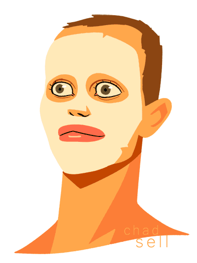
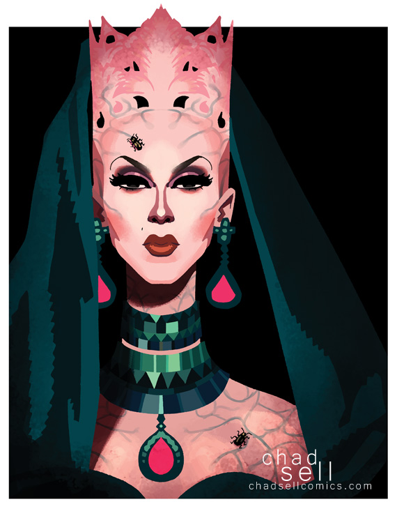
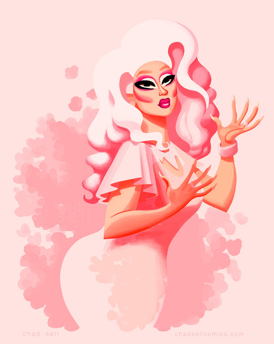
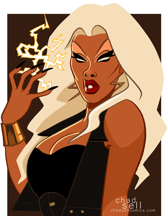
ALL STARS 2: Episode 5
Okay, so scheduling didn't work out with the queen I had been planning to interview about this week's ALL STARS, so I was going to host this gig alone. How hard could that be, right? But then this weird woman in green showed up, insisting I needed help, spewing salad based puns at me in a nearly indecipherable lisp.
Chad: So, I guess I'm being joined today by Tasha Salad? Um, welcome? Do you actually exist, or are you just a fictional character created by Roxxxy Andrews?
Tasha: Resht Ashurred Chad, Tasha's here to shave the day, jusht like I helped Roxxxy in her time of need.
Chad: Oh great, because that worked out well. So do you always magically appear when the desperate and humorless need hosting help?
Tasha: That'sh right, and I often appear before dinner as a light asshortment of greensh and veggiesh and dresshing.
Chad: Right... because... salad. Cool. So, uh, Tasha... this week it felt like we spent a decade or so discussing who was under the bus, who had thrown someone under the bus, who was driving the bus, and where that bus was going.
Tasha: They chopped up that shalad 'til it was cabbage shoup!
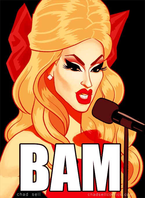
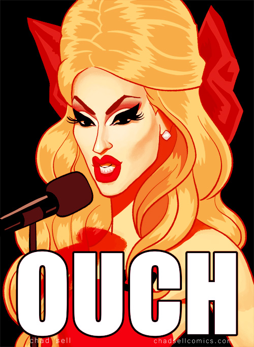
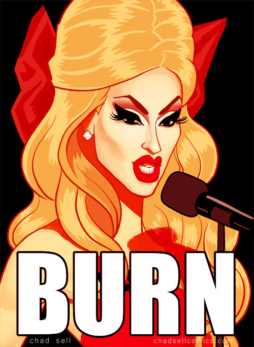
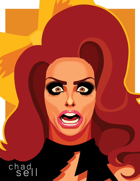
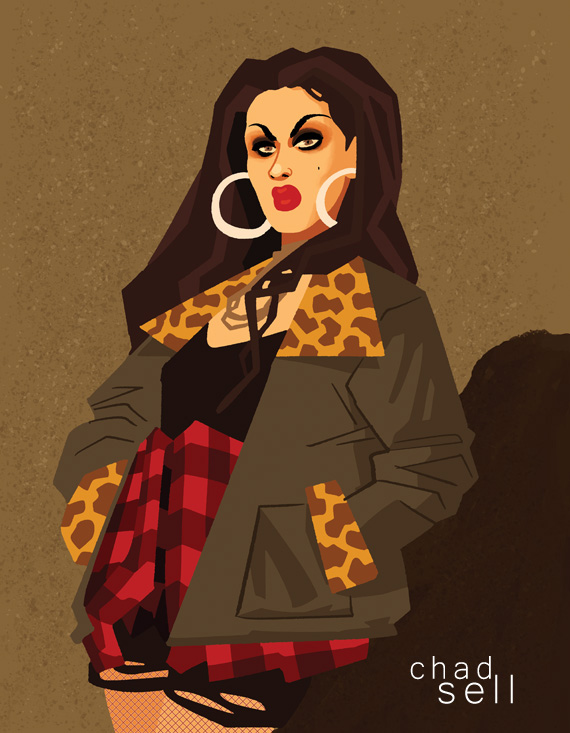
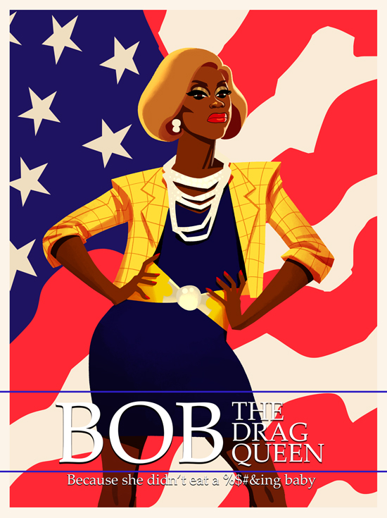
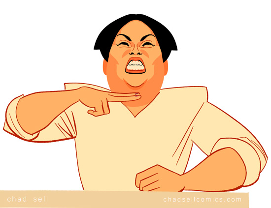
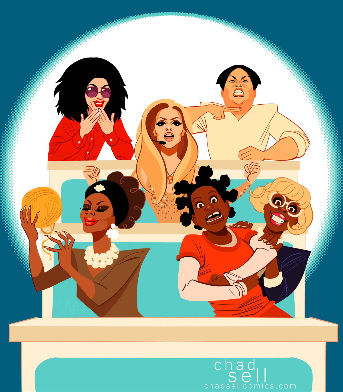
Chad: Wait, Alaska??? Did you show up just to punctuate that terrible salad pun? All of you, quiet down and let me talk, because this is my shitty blog. Okay? Now, as I was saying, I have this theory: Alyssa and Phi Phi are like matter and anti-matter, fundamentally opposites, and when they come together, the results are explosive. Phi Phi is super talented, particularly with her cosplay and her more cartoony, creative looks. But she just can't get a break. She works and works, and she wants that steely determination to win her accolades and acclaim. But that's not how this game WORKS. Her scheming and quibbling and defensiveness just make her unlikable, with the gleeful assistance of the producers and editors of this show.
Tasha: Absholutely.
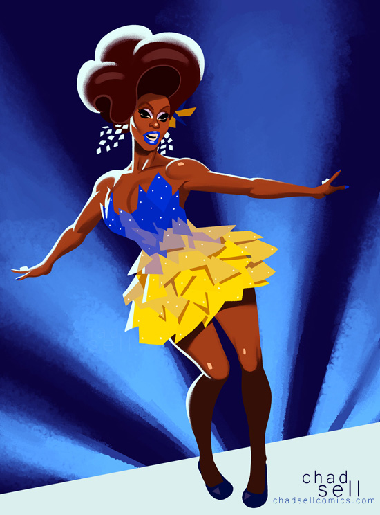
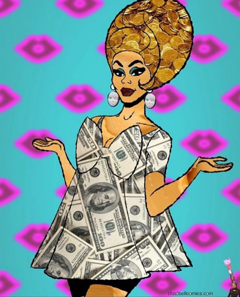
Chad: Oh good, I'm so glad you agree. Now, Alyssa is painfully likable. She can't help it. None of Phi Phi's colorful cartoon cosplay can ever make her as much of a cartoon character as Alyssa already is. She keeps “coasting” through this season because she's entertaining and makes for good TV, and this is a TELEVISION SHOW. And most crucially, Alyssa learned an important lesson from her season, whereas Phi Phi has not – ditch the drama. During the fifth season, quite frankly, I didn't like Alyssa very much. She was tied up in this feud with Coco that didn't do either of them any favors. Their fighting kicked up such a cloud of Dorito dust that it was hard to see either clearly. But this time around, Alyssa doesn't let that shit stick – when Phi Phi pulled her aside in the workroom, eager to argue her case, Alyssa, was all, “Girl, I respect you, I love you, there's no drama, let's hug.”
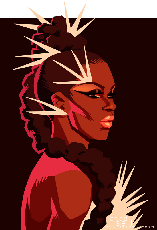
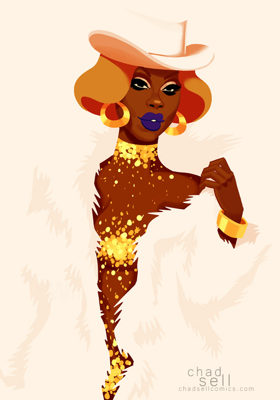
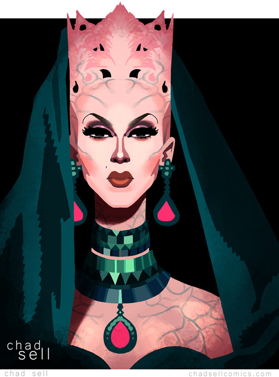
Alyssa looks like she's having the time of her life on this show, living her gig, and the season has been better for it. But you see Phi Phi struggling every minute she's on the show, second-guessing herself and the other queens. Frankly, I don't think she committed any grievous sins in the competition to warrant the hate she's been getting, but she definitely didn't play the game right. Despite her considerable talent, it was all pretty painful to watch. She wasn't enjoying it, and neither were we. Except for that badass blue alien costume. I want that in EVERY COLOR of the rainbow every day for the rest of my life.
Tasha: Sho Chad, when are you going to show us shome actual art? Shometime thish week?
Chad: Well, gee, that's surprisingly hostile.This season, the format of the show seems to have been shifted around to allow the maximum time for drama. Mini-challenges? Nearly none of them. Runways? Not this week! An episode of Untucked tucked right back into the episode proper? Sure, yes, bottom queens, explain to all the tops why you're the better bottom.
All of that makes for FABULOUS television. But it sometimes leaves this poor drag illustrator without much material. During each commercial break, I kept wondering, “What will the runway theme be? Whose looks will I draw this week? Wow, All Stars has been great!” And then, a good 55 minutes into the episode, I realized, “This is an amazing episode and I have nothing to draw.” HOW COULD THE SHOW DO THIS TO ME????
Tasha: Keep crying into your shalad, asshole, and your croutonsh won't shtay dry.
Chad: What? I wasn't, I.... fine, let's talk about the challenge. I thought it was amazingly put together -- how it paired the kicked off queens with the remaining ones, how it gave such amazing drama at the end for the chance to return. It was all tossed together like some perfect, tasty... salad?
Tasha: Don't pander to me, nerd.
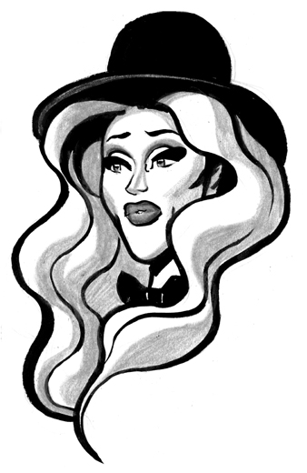
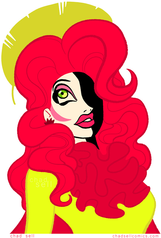
Chad: Okay, I'm just going to hurry along, because I'm feeling really uncomfortable, and you're looking at me with those hungry, hungry eyes. So, I think Alaska and Alyssa made an amazing team, despite their uneven performance last week. As Baby JJ, Alaska got all the good stuff in that scene, and Alyssa was stuck playing the straight, serious one (more or less). But this time, Alaska has perfectly utilized Alyssa's "off the cuff buffoonery" and structured it to give herself those perfect, punctuating punchlines, which was, frankly, genius.

Tasha: What did you think of Roxxxshy's hoshting, Shad?
Chad: Um, I mean, I think Roxxxy said it, herself: "I'm just here to look pretty." What did you think of Phi Phi and Coco's surreal fever dream of an SNL skit?
Tasha: It wash an awkward mish-mash of problematic shtereotypes and sheriously unfunny.

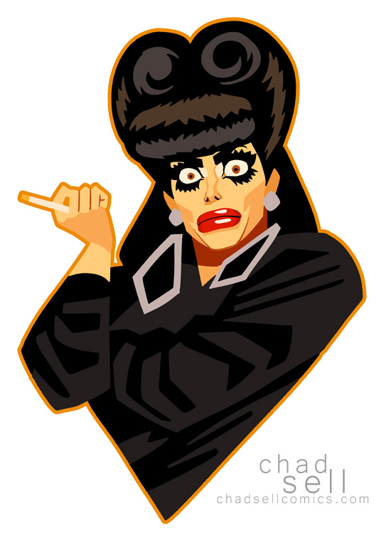
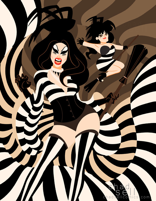
Chad: Well said. Detox and Tati made a surprisingly good team, even though I didn't like that weird, lispy old lady voice Detox was using.
Tasha: Choicesh.
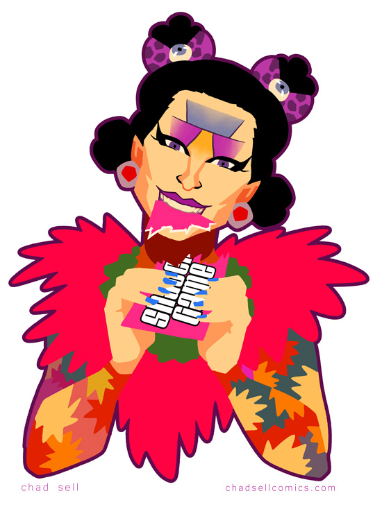
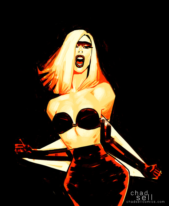
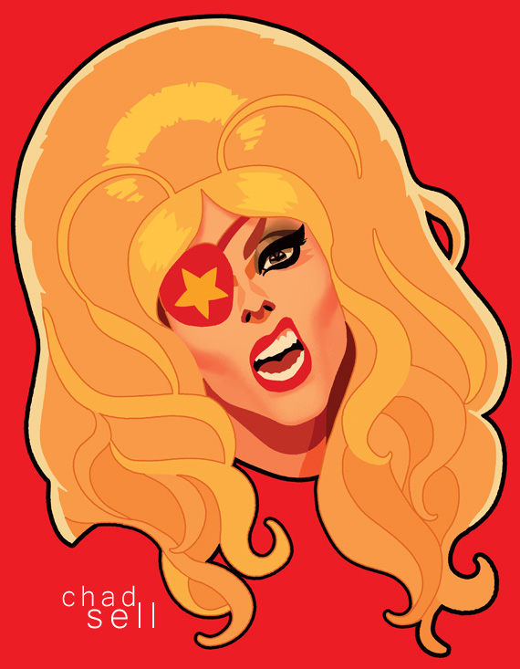
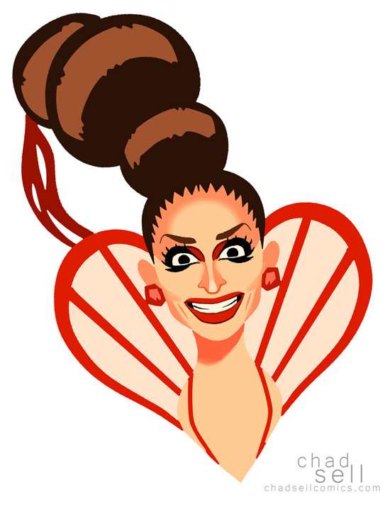
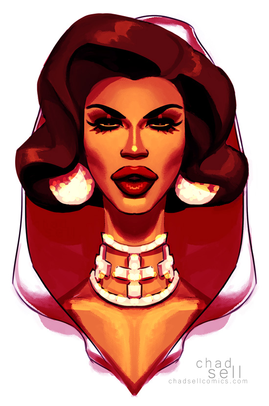
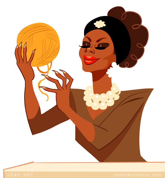
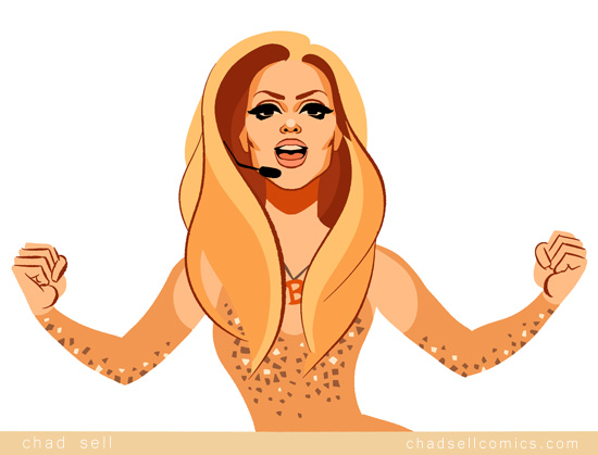
Chad: Ginger and Katya were criminally under-appreciated this episode. I think it's because Ru didn't want Ginger back on the show, and she didn't expect that Ginger would offer a lip sync that could have come close to the legendary, orgiastic one that Tatianna and Alyssa birthed out on that stage.
Tasha: The matching outfitsh! Those shexy movesh! It wash shtupendous!
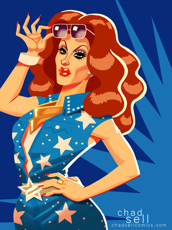
Chad: Seriously, I'm thrilled to see both Tati and Alyssa returning! I feel like the producers of this show carefully calibrated the last few episodes so that this week's would culminate in the absolute loudest cheering in a gay bar that is scientifically possible.

Chad: Despite my misgivings about Phi Phi's performance and depiction on this show, I agree with my friend Melissa's shouted assessment from the screening party: "Best Drag Race season, ever!" I have plenty of complaints about the show week by week, but I think the producers are making magic this time around.
Tasha: Are we almost done here? Becaush theesh leavesh are shtarting to wilt.
Chad: Yeah, Tasha, I'm ready for my main course, so GO BACK TO HIDDEN VALLEY RANCH WHERE YOU BELONG.


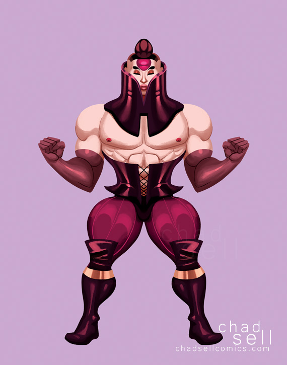
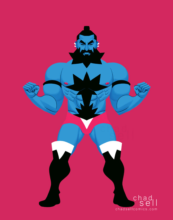
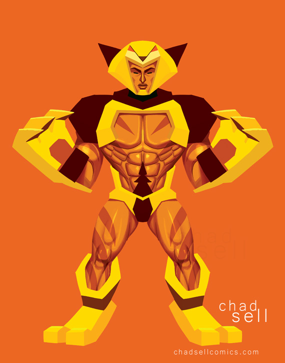
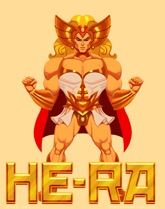
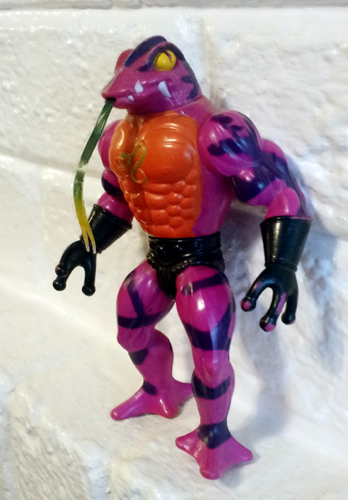 I had a major revelation on Thanksgiving. While rooting through an old closet at my parents' house, I dug up my old HE-MAN toys. And I realized, "Wow, these are everything."
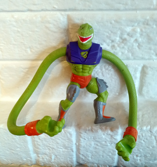
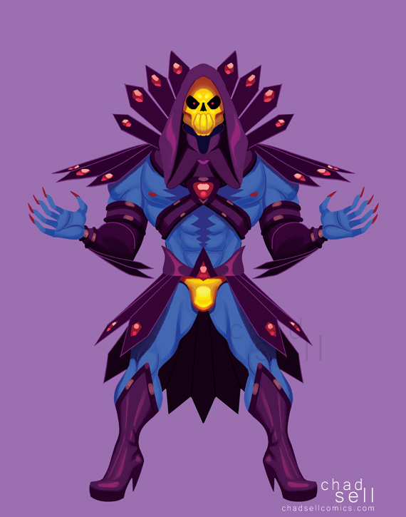
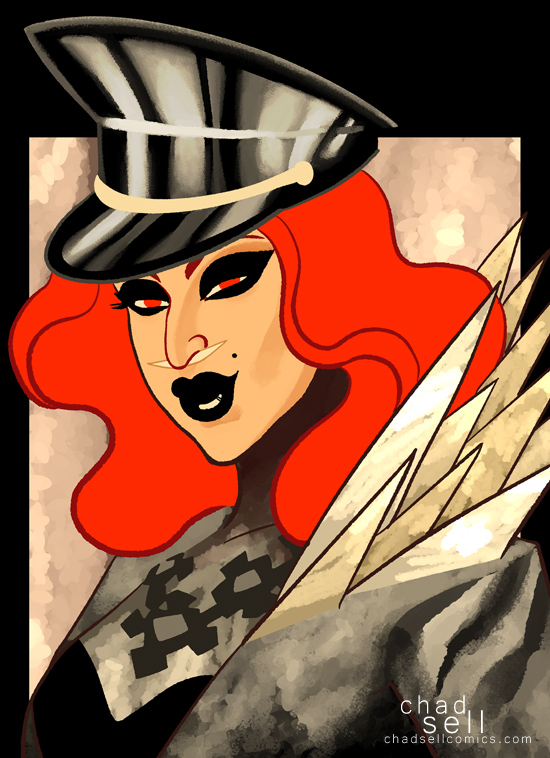
 BOLTT, one of my favorites.

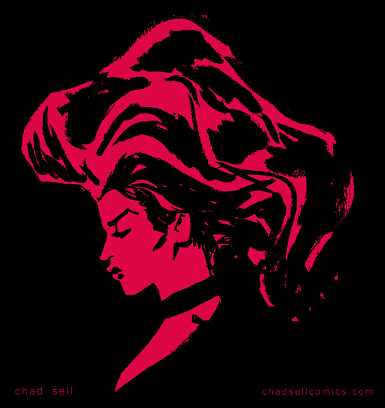
 One of my very favorite artists working in superhero comics today is
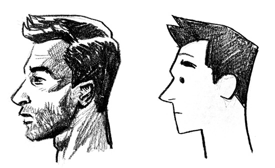
  Stop worrying about what looks "real" and concern yourself with what works.
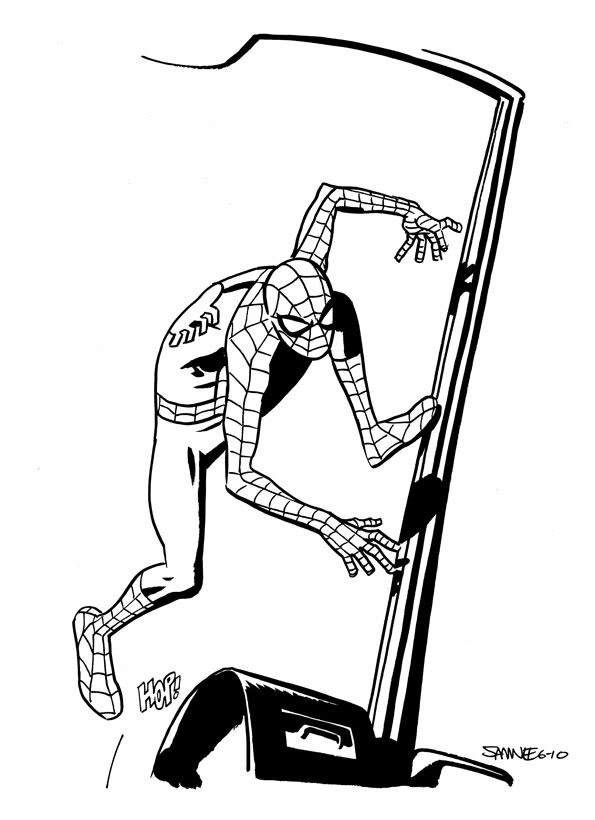
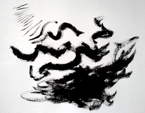
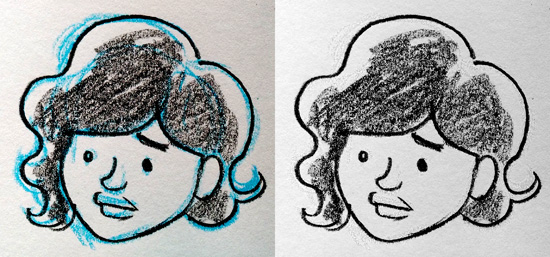
  If you're not working digitally, take frequent breaks to step back from your desk and see how it looks from afar.
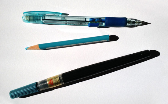
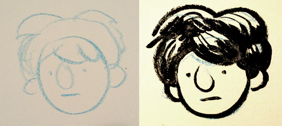
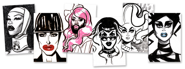
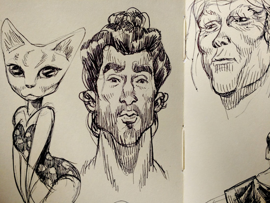 In the spirit of loosening yourself up, sometimes keeping things tiny will help, too. I really enjoy sketching in my tiny Moleskine book, because the little pages will keep you from getting too precious or detailed with your work. I find myself using a simple Bic pen in my Moleskine, because I can get incredibly delicate lines that work perfectly at that small size.
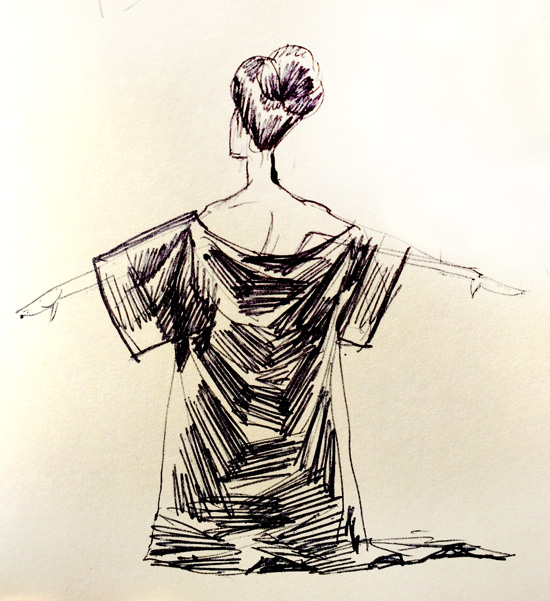
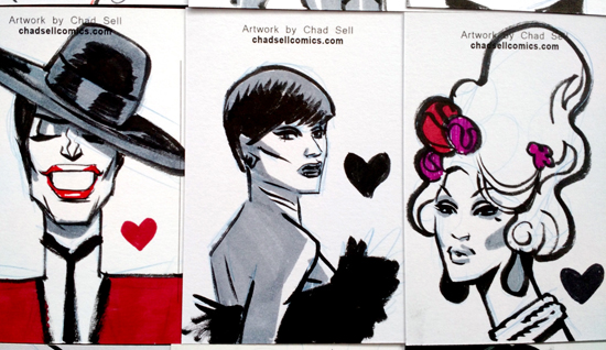
 I really look forward to my monthly postcard sketches for my
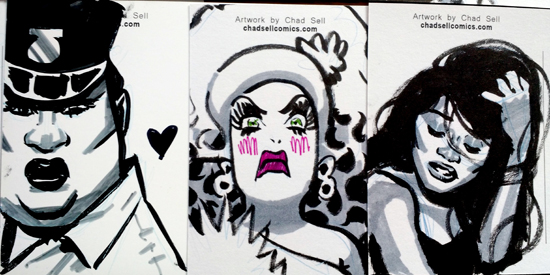